I read a lot of web articles on my e-reader (often using Push to Kindle which is fantastic). I left the Kindle ecosystem a while ago and Pocketbook (a TouchHD 3) has been a good home so far.
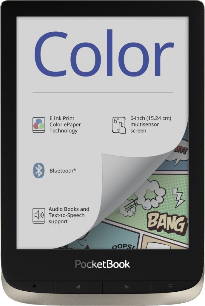
Since my content is often a mix of text and non-text, I was appealed by a color eInk screen. The Pocketbook Color recently came out and I purchased one to test it.
Here are my conclusions after about two weeks of usage:
Pro
- While limited in their range, colors work well for diagrams, illustrations and screenshots. Photos can look a bit awkward but it’s definitely better than greyscale.
- Before this e-reader, I haven’t read comics on a device but with color it’s quite fun. The clipping tools in the UI are useful to get rid of white borders around the actual comics.
Con
- It’s not very suitable for night time reading (which is my main use case), the minimum brightness is high, there is only white backlight.
- With the strong white backlight it feels like an LCD screen which kind of diminishes the idea behind eInk.
- The technology seems to use two layers: one “common” 300dpi greyscale, and one around 150dpi color layer. This results in a pattern overlaying the whole screen making the screen less crips when reading text.
- Pocketbook readers are rather slow. I always wonder how they do scrolling and inertia so much better than Kindles but feel so. slow. navigating through the UI.
Overall, I think color eInk is technology well worth exploring, especially when no backlight is necessary and it doesn’t need any battery power (think photo walls)
I am torn whether I’ll keep the Pocketbook Color as my main reading device because using the reader in the dark is like turning on the light in the room.
Fediverse reactions
Post URL
Your Profile
Why do I need to enter my profile?
This site is part of the ⁂ open social web, a network of interconnected social platforms (like Mastodon, Pixelfed, Friendica, and others). Unlike centralized social media, your account lives on a platform of your choice, and you can interact with people across different platforms.
By entering your profile, we can send you to your account where you can complete this action.

Leave a Reply