While I keep maintaining my Friends plugin for WordPress, there is an area where it could do better because I am not great at it: the visual appeal.
From pretty early on, I designed the plugin in a way that it
- can be mainly used on the frontend (i.e. not in wp-admin),
- is based on granular template files,
- and each template file can be overriden.
Over time, some of this has changed or improved. For example, you can now see your friends’ posts in widgets on your wp-admin dashboard, or, I’m making progress on providing a block theme for Friends so that it can be customized with the site editor.
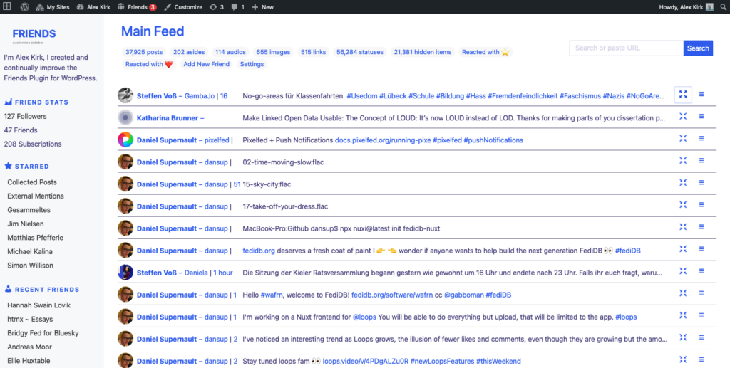
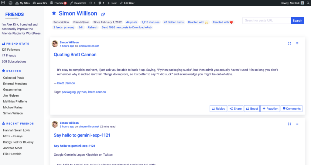
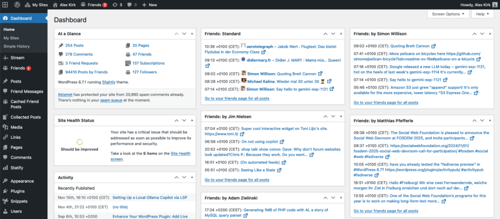
But, even as I wrote in the Friends Wiki on how new themes can be created, I think this has remained unknown to users.
So, a year ago, as a demo, I created the Mastodon-Like Interface plugin. This is what the Friends plugin can also look like:
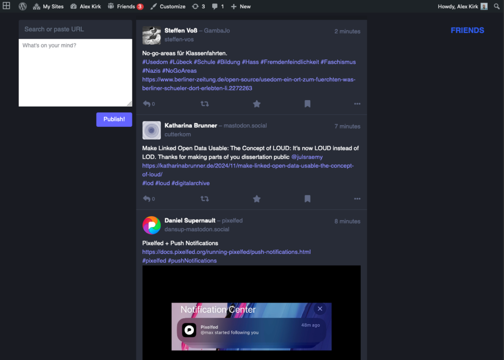
Unfortunately, this remained under people’s radar. So in the latest version of the Friends plugin, I have now made it more obvious that the theme can be changed, by slightly adjusting how themes are loaded, giving the user more control over which theme is loaded:
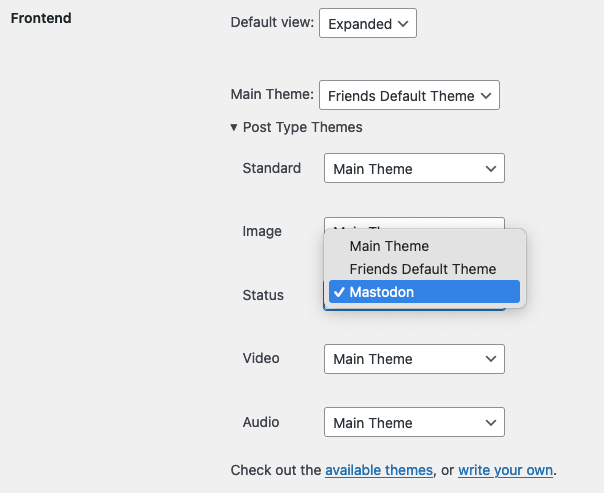
In the course of this, I have updated the Friends Wiki with a more specific guide on how to write themes for the Friends plugin.
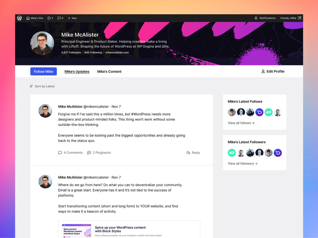
There have been some case studies about what a network between WordPresses could look like. For example, Mike McAlister has designed some screens for what he called OpenPress at the time. And the mockups look great:
I would love it if the community could help with creating some more themes to give people a choice. Recently, Livia Gouvêa has contributed some layout improvements for the current sidebar. This is a great start, thank you, Livia! If you have a new theme, you can add them with a pull request to the THEMES.md file. As soon as there are some themes, we’ll make it easier to install them.
It is quite likely that people were detracted from getting started with the Friends plugin because they don’t like the current theme (hat tip Robert Windisch and his talk at WordCamp Karlsruhe) but this would be too bad, because I believe it is an empowering tool, allowing you to become less dependent on third-party vendors, even if you’re “just” using it to make your own WordPress your full featured, personal Mastodon instance.
Looking forward to more Friends themes, this would be an awesome addition!
Thank you very much for this plugin, I like it a lot. But I have some problems: I tried to install the Mastodon Theme and selected it in the backend but it’s not showing up. Also, within Mastodon Apps posts by e.g. Mastodon don’t show up, only WordPress-Posts. I tried this with different blogs on shared Hosting.
Remote Reply
Original Comment URL
Your Profile
Thank you and thanks for reporting! There was a bug in loading the main theme indeed https://github.com/akirk/friends/pull/398, and a bug with overriding some templates. Will be fixed in the next version, you’ll need to re-download the mastodon-like theme plugin, sorry about that!
With Mastodon Apps do you mean the Enable Mastodon Apps plugin? The content should be the same that you see in /friends/. In the “Registered Apps” settings, click on details for the specific app and ensure that the right post formats and post types are selected.